Small Select Multiple Inputfield for ProcessWire
A lightweight Inputfield that adds multiple selection ability to the regular browser native
single <select>. It is simpler and easier to use than a normal select multiple.
The goal was to have a multi-selection input that was as simple as single-selection input, and that didn't introduce new UI elements, sticking just to native browser controls.
It works the same as a regular single <select> in how you make a selection. Selected items are indicated
by a check or radio button (or something else if you configure it). Clicking a selected item de-selects it.
Requirements- ProcessWire 3.0.229 or newer
- PHP 7.1 or newer
More detailsIt provides multiple selection while taking up no more space than a regular single select.
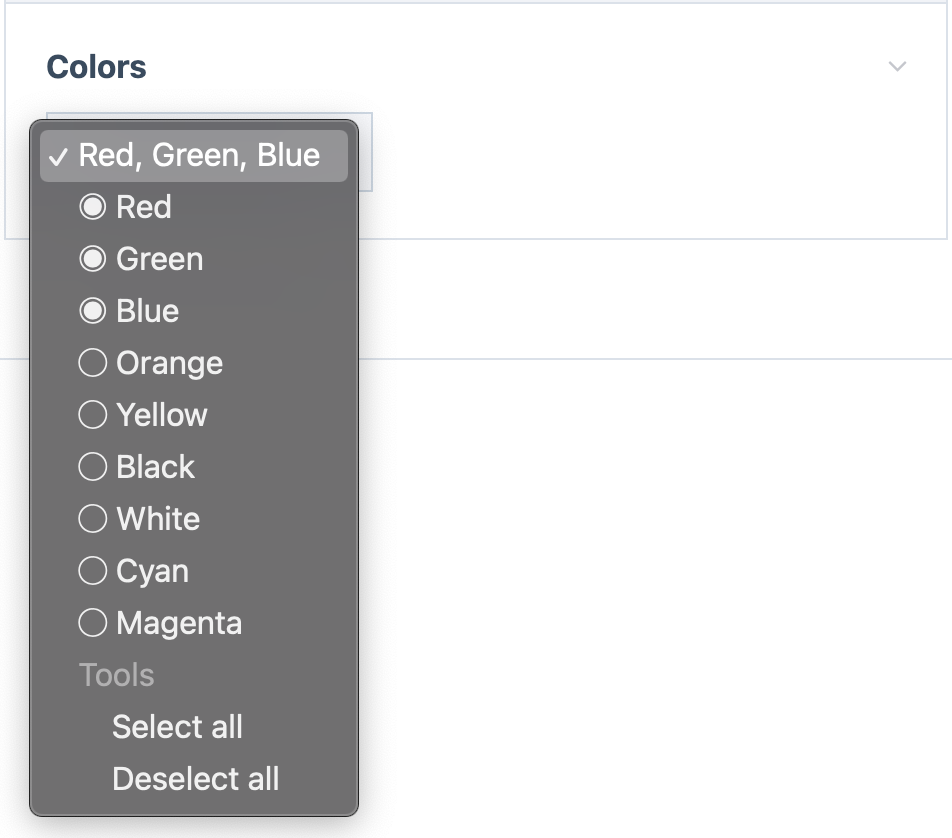
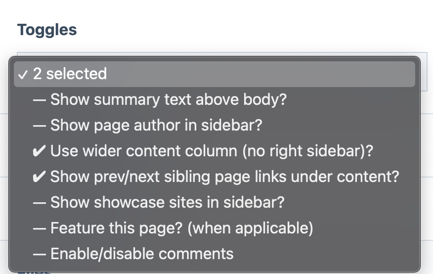
Selected versus non-selected state is indicated by using UTF-8 checkbox or radio button icons,
or whatever indicator you want to use (whether UTF-8 icons or text).
Has a simpler presentation than other multiple selection options, making it ideal for large
forms with lots of inputs that might otherwise look complex.
Unlike AsmSelect (our other custom multi-selection widget) the input does not grow vertically
as additional options are selected, making it good for cases where vertical space may be limited.
The label for the select can either indicate the quantity of items selected, or it can present
a CSV list of selected items.
Provides the ability to select-all or deselect-all.
This module extends InputfieldSelectMultiple and can be substituted anywhere that module is used.
The most common use cases would be with ProcessWire SelectOptions and Page fields. It can also
be used with FormBuilder or any other InputfieldForms. It can also be used outside of ProcessWire forms.
Optgroups are supported in the same way that they are in InputfieldSelect.
Installation- Copy all the files for this module into /site/modules/InputfieldSmallSelectMultiple/.
- In your admin go to Modules > Refresh.
- Find this module on your Modules “Site” tab and click “Install”.
Usage in fieldsOptions fields:
Create a new field using the “Select Options” and select “Small Select Multiple”
as the input type.
Page fields:
Create a new field using the “Page Reference” type. On the “Input” tab, select
“Small Select Multiple” as the Input type. If you do not see the option available, edit
your InputfieldPage module settings and add “Small Select Multiple” as an allowed type.
Other types:
You should see the option to use “Small Select Multiple” anywhere that you see ProcessWire’s
other multiple selection types available.
Configuration notes
It provides multiple selection while taking up no more space than a regular single select.
Selected versus non-selected state is indicated by using UTF-8 checkbox or radio button icons, or whatever indicator you want to use (whether UTF-8 icons or text).
Has a simpler presentation than other multiple selection options, making it ideal for large forms with lots of inputs that might otherwise look complex.
Unlike AsmSelect (our other custom multi-selection widget) the input does not grow vertically as additional options are selected, making it good for cases where vertical space may be limited.
The label for the select can either indicate the quantity of items selected, or it can present a CSV list of selected items.
Provides the ability to select-all or deselect-all.
This module extends InputfieldSelectMultiple and can be substituted anywhere that module is used.
The most common use cases would be with ProcessWire SelectOptions and Page fields. It can also be used with FormBuilder or any other InputfieldForms. It can also be used outside of ProcessWire forms.
Optgroups are supported in the same way that they are in InputfieldSelect.
Installation- Copy all the files for this module into /site/modules/InputfieldSmallSelectMultiple/.
- In your admin go to Modules > Refresh.
- Find this module on your Modules “Site” tab and click “Install”.
Usage in fieldsOptions fields:
Create a new field using the “Select Options” and select “Small Select Multiple”
as the input type.
Page fields:
Create a new field using the “Page Reference” type. On the “Input” tab, select
“Small Select Multiple” as the Input type. If you do not see the option available, edit
your InputfieldPage module settings and add “Small Select Multiple” as an allowed type.
Other types:
You should see the option to use “Small Select Multiple” anywhere that you see ProcessWire’s
other multiple selection types available.
Configuration notes
Options fields:
Create a new field using the “Select Options” and select “Small Select Multiple” as the input type.Page fields:
Create a new field using the “Page Reference” type. On the “Input” tab, select “Small Select Multiple” as the Input type. If you do not see the option available, edit your InputfieldPage module settings and add “Small Select Multiple” as an allowed type.Other types:
You should see the option to use “Small Select Multiple” anywhere that you see ProcessWire’s other multiple selection types available.
Configuration notes
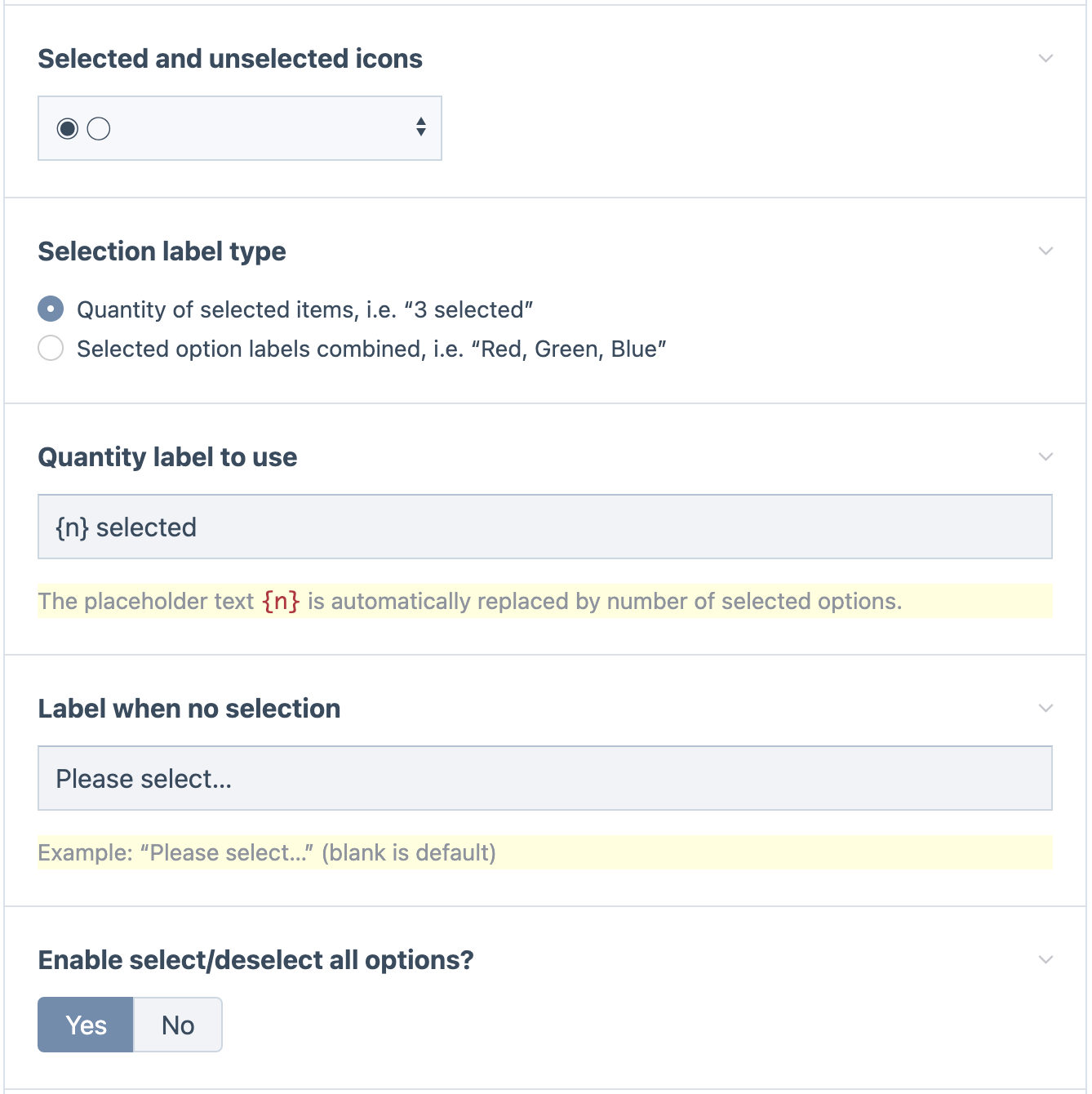
If the users are more mobile-based, test the different icon options to see which works best. I've found that on mobile devices (in Android at least), the strong check mark icons are the clearest, because the browser native widget already has radio-button looking items for each option.
If users will be potentially selecting a lot of items, I recommend sticking to the "Quantity of selected items" label type, as it doesn't consume more horizontal space as more options are selected.
Screenshots
Closed state, indicating selected options:
Closed state, indicating quantity of items selected:
Opened state to make selection (actual appearance will depend on browser and platform):
Another example of the opened state, using different settings:
Settings screen:
Install and use modules at your own risk. Always have a site and database backup before installing new modules.


