Since posting about the 2017 roadmap a few weeks ago, I've been trying to jump into all the aspects of it as early as possible. This week focus went towards one of the major priorities for 2017, which involves creating a new admin theme for ProcessWire. After giving it a lot of attention this week, I feel like there's now a good strategy in place for how it'll all come together as a collaboration. In this post we'll take a close look at all the details.
Uikit front-end framework
We've been talking more and more about using an existing front-end framework for our admin theme as a way to open more doors. The one that comes up most often is Uikit. This is also what we used for our recent Skyscrapers profile update, as well as the Regular site profile, from a couple of weeks ago (which we plan to include in our next master core version). I'm also seeing more and more ProcessWire-powered sites using Uikit, so it seems that there is a large group of people that like using ProcessWire and Uikit together. And I have to agree, they are both great tools and work beautifully alongside each other.
While I want to limit what dependencies the overall core has to any front-end frameworks, I did think it was worth experimenting with the use of front-end frameworks in our admin theme (and specifically Uikit). After putting it to the test this week, I think it's a good way to go.
What about jQuery UI?
ProcessWire has always used jQuery UI, and we have a decent amount of jQuery UI-specific code in our core. This code powers various components including sortables, modals, drop down menus, datepickers and more. jQuery UI provides some very specific components that are more powerful than the alternatives I've seen in any other front-end framework. As an example, Uikit has a beautiful navbar component, but I can't push it to do what we need like I can jQuery UI's ui-menu component, even if Uikit's is a lot prettier.
While there are some areas of crossover between Uikit and jQuery UI, for the most part they are different animals. jQuery UI focuses on providing some specific components in an incredibly comprehensive manner, but doesn't get involved in bigger picture grid systems, typography, or the like. You use jQuery UI when you need specific components, but you never use it as a foundation for the front-end of your site.
jQuery UI and Uikit together
In using Uikit and jQuery UI together, I found they make a nice pair. What jQuery UI lacks in appearances, Uikit picks up the slack in being able to theme jQuery UI components. And jQuery UI nicely fills in the gaps where we might need a Uikit component that can do more than what's built in to it. For instance, I setup Uikit to style jQuery UI's ui-menu component. This gives us what appears to be the new Uikit 3 navbar component, but with multi-level, ajax-loaded menus. That's something that Uikit doesn't do out of the box, but jQuery UI does.
What makes this relatively simple (or at least simpler than it otherwise would be) is the Less-based theme and build process used by Uikit. I found that not only does this make a nice theme process for Uikit, it makes a nice theme process for the front-end parts of a ProcessWire admin theme. Less lets you use any existing defined class as a Mixin, and Uikit has been pretty comprehensive about defining useful Less variables for everything. This enables us to map these existing classes (as mixins) and variables directly to existing jQuery UI and ProcessWire classes. For a simple example, we can map Uikit's uk-button styles to jQuery UI's ui-button elements like this:
.ui-button {
  .uk-button();
}
.ui-button.ui-state-default {
  .uk-button-default();
}
The above basically says that whatever styles are setup for Uikit button elements, make them apply to jQuery UI button elements. Though for most cases, we do have to go beyond that and reference Uikit's Less variables, which is also quite handy.
The end result is that you'll be able to use a Uikit theme (and/or build process) to theme the ProcessWire admin. All PW-specific classes get mapped to Uikit variables, so you can adjust Uikit variables, compile, and get a whole new PW admin. This provides some much needed additional structure to our admin theme system. But since there is no Uikit dependency in the rest of the core, the existing Default and Reno admin themes continue to work just how they always have.
Calling all designers
While my college degree is in design, I've been in the code side for so long now that I've got no business designing official admin themes for ProcessWire. Especially considering all the incredible design talent we have in our community. So what I've been doing here is coming up with a basic admin theme profile that the skilled designers in our community can then run with. My hope is this will be a collaboration where we'll come up with the best admin themes anyone has ever seen for any CMS. As a community, we'll want to select one or two that we can also bundle with the core in ProcessWire 3.1 as well.
You'll be able to use the Uikit 3 framework to make it look and function however you want. This means you can focus on styling Uikit components (via their build process) and they will automatically map to the equivalent ProcessWire and jQuery UI components. So whether you are creating a unique new admin theme, or simply theming the new default one, this task will be a lot simpler than it ever has been before. Plus, you'll now have the great Uikit base, grid, utilities, responsive features, and everything else, ready for you to use in your admin theme.
Timeline
While using a new front-end framework in the process does simplify a lot of things, the reality is it's still going to be a lot of work. I think I've got another 2-4 weeks to go before I can release this and have everything working perfectly as a new base admin theme to build from. But right now the foundation is there and working nicely along with the Uikit theme process. So with some good momentum already, I'm going to keep going with it.
Examples
Here's a few screenshots to demonstrate the progress. Keep in mind, these are stock Uikit 3 styles here, as I'm going to leave the actual design/theming to our community of skilled designers. Though admittedly I'm pretty pleased with the stock appearance that Uikit comes with. The layout of course is also open-ended. For instance, if you like a 2-column layout (like Reno) rather than 1-column layout (like Default) then that's a simple matter with the built in grid system. Nothing is set in stone, and our focus is on establishing the system to provide the path and flexibility for it all.
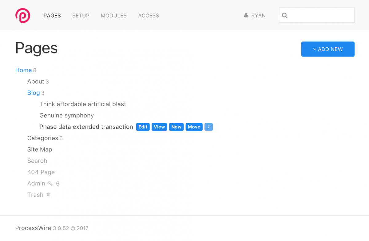
In this minimal page list screenshot you can see something that is somewhat similar to the current Default admin theme in layout. But we're sticking with using Uikit Less variables for the colors, so everything is based off of the default, primary, secondary and muted colors defined in a Uikit theme. If you ever played around with styling PW's existing default theme, you had countless colors to consider, and that's definitely something we didn't want to repeat.
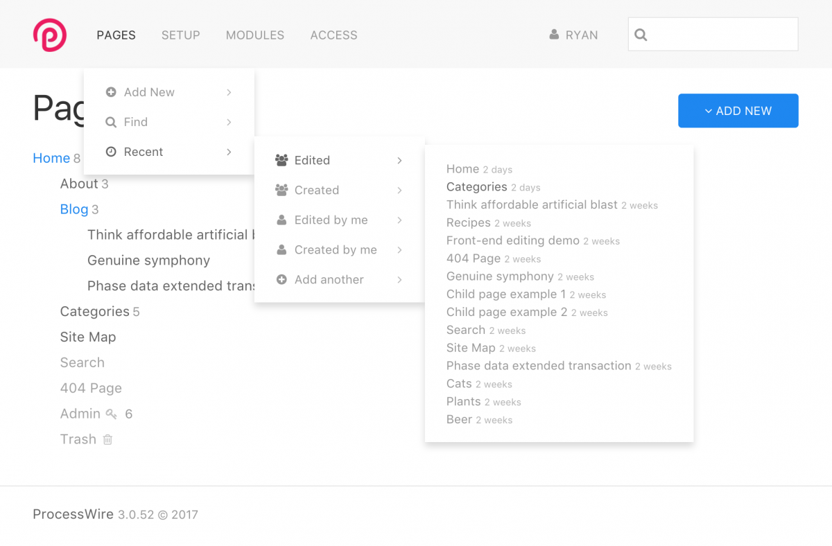
Here's the same screenshot as above, but with the top navigation open. This is actually a jQuery UI ui-menu navigation, but with all the Uikit dropdown styles mapped to ui-menu styles. Meaning, essentially a Uikit 3 navbar with dropdowns that support any level of depth and can have the items loaded by ajax requests.
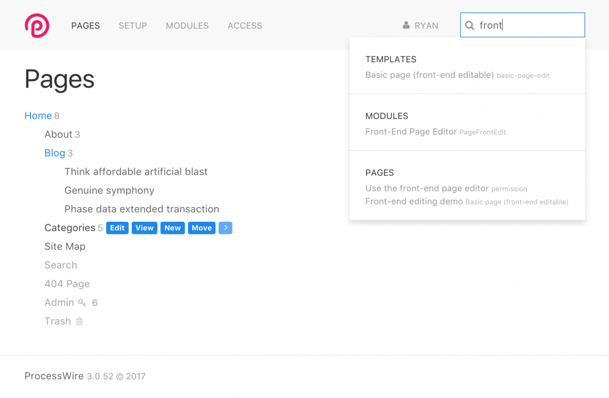
In this next screenshot, you'll again see a jQuery UI ui-menu styled with Uikit 3's dropdown component, but this time for our ajax admin search engine.
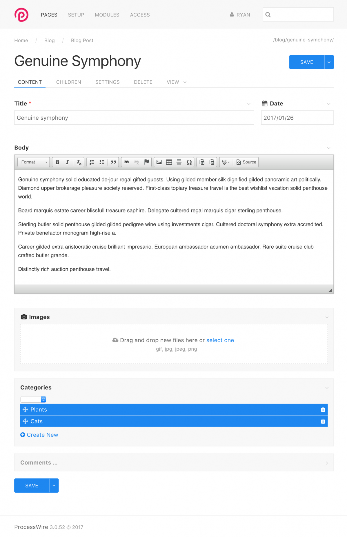
Here's a simple page editor screenshot. Inputs are now inheriting their look from the Uikit form component, and the WireTabs at the top are inheriting from the Uikit tab component. Something else notable here is that we're adding the ability for Inputfield elements to either be free or contained. You'll see the Title, Date and Body Inputfield elements are free, while the Images, Categories and Comments Inputfields are contained. I'm working to setup logical defaults so that Inputfields that don't visually benefit from being contained will instead be free by default. This is something that I think we'll be able to make configurable per-field as well.
Wrapping up
I'll be continuing to work on this next week, along with ProcessWire 3.0.53. I hope by ProcessWire 3.0.54 or 3.0.55 I'll have this admin theme ready to share so that we can begin to collaborate on it. Before I put it on GitHub I just want to make sure that everything works perfectly and that there aren't any gaps. The plan is that we can eventually replace our existing Default admin with a new one that results from this process. Hope that you all have a great weekend and enjoy reading the ProcessWire Weekly this weekend as well.
Comments


HMCB
- 8 years ago
- 111
★★★★★Oh, this looks so sweet. Clean. Polished. I love the white space. Awesomeness!
Reply
tpr
+1
The default ckeditor toolbar looks like a dinosaur in such a modern environment.
Reply
szabesz
+1 :)
Reply
laban
- 8 years ago
- 71
★★★★★This is great! Uikit3 has already become a favorite of mine. And I have 3 ProcessWire sites using it since a few weeks ago.
Even though I think today's default theme is great, this update could absolutely be a good thing as well. To stay modern with the admin theme could open more eyes. I know I am often relying on admin themes as first impression.
Reply
tpr
Good question - I'm afraid I have to heavily adjust the module. I'm also considering to create a new theme instead of patching, but first I need to explore the new default theme.
I would still love to see some AOS ideas appearing in the core theme.
Reply
szabesz
My proposal is this:
https://processwire.com/talk/topic/15532-new-blog-post-working-towards-a-new-admin-theme/?do=findComment&comment=138870
If you have the time, why not participating in the development of this theme, rather than working on your own?
Reply
tomreno
Looks great so far. Really looking forward to working with this.
Reply
Eduardo
This was my first thought when looking at the new admin!
Reply
Eduardo
This is looking really great! I always felt ProcessWire needed an admin with "less hard lines" though it has always worked amazingly, sometimes with too much fields it started feeling a little line cluttered. All that white space looks nice! :D
Reply
AndZyk
The newest CKEditor 4.6 has a lighter default skin, so it would be enough to upgrade the core CKEditor: http://ckeditor.com/blog/CKEditor-4.6-released ????
Reply
Joe Regan
Love the new direction!
I think ui kit stacks up favoribly vs bootstrap 3. How do you think it will stack up vs bootstrap 4 when it is released?
Reply
Tom
- 8 years ago
- 20
★★★★★This is great! I love UIKit 3, I'm so happy for the loss of the hard lines as if everything was in a box. It makes everything feel more open and clean.
I actually use a heavily customised version of the Reno theme that I created.
I'm happy to get involved with designing the new admin theme :-).
I did the EIZO website and many others, I'm sure all would appreciate a more polished admin interface :-).
One big request I'm getting is the ability to define crops, much like the CroppableImages module, however with ProcessWire 3 support.
Reply
can
- 8 years ago
- 10
★★★★★great work ryan i'm looking forward to :(
Reply
Brent
- 8 years ago
- 80
★★★★★Looks fantastic! I love where you're going with the new UI. Please consider making lightwire the default skin for CKEditor (https://github.com/NicoKnoll/LightWire-Skin ) It will fit in much better with the default UIKit starting point (and upcoming community designs).
Reply
Joel S
- 8 years ago
- 10
★★★★★Once again Ryan you nailed it here. Love it. One question: will this play nice with AdminOnSteroids module?
Reply
Mike Rockett
- 8 years ago
- 30
★★★★★Most-exciting! Definitely a plus to remove hard-lines, and definitely loving the whitespace! :D
Reply
Peter Knight
I love UI Kit and having an admin theme running UI Kit 3 would be a dream. Looking forward to exploring some theme making.
When we can get our hands on this. Realise it's a WIP
Reply
diogo
Looking great! I love the simplicity of this, and the possibilities it opens. Bullseye Ryan!
Reply
thetuningspoon
Honestly it looks perfect so far! I've always liked the current default admin (with the exception of some of the boxiness) so I was a bit skeptical of changing it, but this looks great. I still think you are a very capable designer, Ryan :)
Reply
Rider
WOW this looks amazing, Can't wait for its release
Reply
Sil
And if you use the new version (4.6) of the ckeditor, it all looks even much nicer/harmonic.
Reply
Nils
Wow, I have to agree: That looks modern, clean and inviting. I would use it right away! Two quick things I was thinking about:
1. Would it be possible to ship the basic admin theme with a more modern CKE skin (without gradients)? I really like the look of the Lightwire skin, and I think something like that would play well with the basic UIkit style.
2. YOOtheme (the company behind UIkit) have created some nice looking themes for Wordpress & Joomla. I was wondering, if they could be interested in creating a theme for ProcessWire as well. Probably they just don't know about the beauty of ProcessWire yet...
I can't wait to try the new theme...
Reply
pmichaelis
Hey,
this is great news. I love the Idea of having an admin theme, that is based on a common css framework. Nevertheless, Reno does quite a good job, with rearanging the default theme. Having a vertical sidebar is one of the most usefull things for my point of view. I think the main design problem lies in the pagelist.
I am nit into uikit, but I would dive into it, if any help is needed.
Thanks for that post.
Reply
pine3ree
- 8 years ago
- 00
★★★★★Amazing job! PW admin interface has always been the cleanest among cmses, ...continuing its tradition. Too bad uikit devs removed date/time pickers in v3.
Reply