ProcessWire 3.0.85
This week I've been back in the office and enjoying working on the core. Big thanks to Bernhard Baumrock for his great post last week about Process modules. I was offline for about 10 days, so version 3.0.85 of ProcessWire on the dev branch has been largely focused on getting caught up with and resolving issue reports (at GitHub). Though there are a couple new things too, which I'll cover below.
Collapsed notifications in core Uikit admin theme
Whenever you save a page or submit a form in the ProcessWire admin, or even login (among other actions), you'll have one or more notifications appear at the top of the screen. Notifications come in 3 flavors: messages, warnings and errors (there can also be debug-mode only versions of any of those flavors as well). Sometimes you might have several notifications appear, especially when developing a site and using debug mode, as many extra notifications are displayed when debug mode is active.
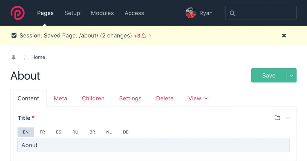
In ProcessWire 3.0.85, when using AdminThemeUikit, notifications of the same flavor collapse into the first, along with a link to reveal the rest in the group. The screenshot below demonstrates what you might see with 4 message notifications:

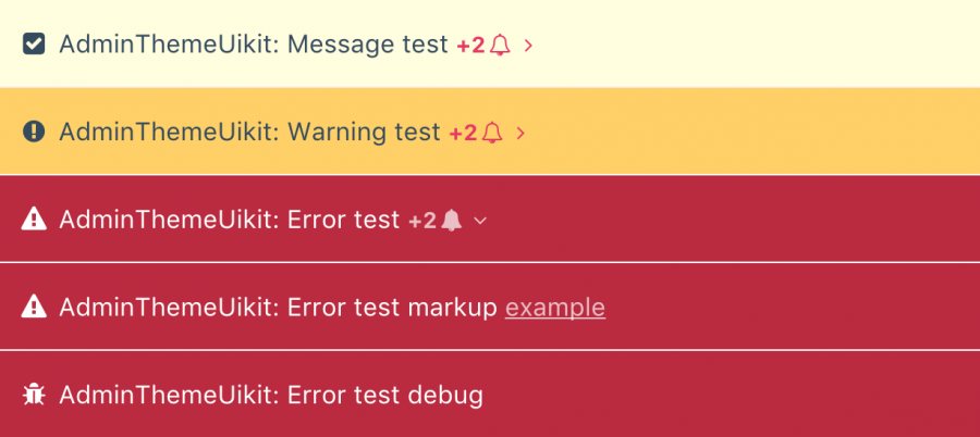
The next screenshot shows a demo screen with messages, warnings and errors, and the errors group has been opened:

This feature is automatically enabled in AdminThemeUikit. But if for some reason, you don't want collapsing notifications, you can also disable it from the AdminThemeUikit module settings (see the "Layout" fieldset). In addition, collapsing notifications are not used if the SystemNotifications module is installed, as that already uses a different type of collapsing notification system.

Checkbox label for checkbox fields
Checkbox fields now support a separately configurable checkbox label, distinct from the field label. Previously this feature was only available at the API level, but can now be specified interactively from a checkbox field's "Input" tab (when configuring a field). Of course, it is fully multi-language configurable as well. This new checkbox label feature is best demonstrated with this contrived example:

In the example above, if no checkbox label had been specified (and no description/notes), then the regular field label would have been shown next to the checkbox instead, and there would be no label or icon present above the checkbox (no header). This is the behavior you are likely already familiar with. Using the new checkbox label gives you more flexibility for those times when you want a checkbox with a little more instruction/guidance for the user, and don't want to have the same label appear both above and within the checkbox field.
As mentioned earlier, ProcessWire 3.0.85 also contains numerous other updates and adjustments, so is a worthwhile upgrade if you are following the dev branch. Hope that you all have a great weekend and enjoy reading the ProcessWire Weekly!