ProcessWire 3.0.119
This week we take a look at what's new in ProcessWire 3.0.119 and then we finish up by taking a look at a few screenshots from the new ProcessWire development website. If you read my post last week in the forum, you may already be familiar with some of these updates, but we'll cover them in a little more detail here.
Auto-opening file/image fields
This handy update comes via Robin S. (@Toutouwai). When you drag an file into the ProcessWire page editor and drag it over a field that accepts files (like file, image or CKEditor field) it will automatically open that field if it happens to be collapsed. See this short screencast with Robin S. demonstrating the feature:

I'm personally thrilled with this feature because I usually keep my file/image fields collapsed when not populated. So I often run into the case where I'm dragging an image in, but have to abandon it once I realize the field isn't open. This solves that.
Chunked ajax file upload
This next update comes to us via @BitPoet, who noted that our ajax upload feature can run out of memory if you try to upload a file that is too large to fit in memory. So BitPoet proposed a specific update for our WireUpload class so that rather than reading the whole file into memory before writing it, it would read 8 megabytes, write it, and then read the next 8 megabytes, write again, and so on. Now it should be able to handle files of any size.
New WireArray slices() method
A new method has been added to WireArray and all derived types: slices(). This method accepts a single argument, which is the number of slices that you want to split the WireArray into. It returns an array of WireArray objects, each containing the number of items you requested. This method is non-destructive, so it leaves the original WireArray in tact.
One example of where this method can be useful is in handling multi-column navigation. For instance, lets say want to have a 3 column layout where a navigation list is equally split among the 3 columns. Here's a look at just such a scenario from the new ProcessWire website sites directory showcase, where we have a "categories" dropdown that appears on hover. Because there's a lot of categories, I want to display it in 3 columns, so that the user doesn't have to scroll:
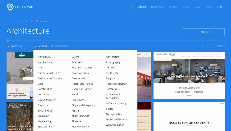
Here's how we're using the slices() method to handle that:
$categories = $pages->get('/about/sites/categories/')->children();
foreach($categories->slices(3) as $items) {
  echo "<div class='uk-width-1-3'><ul>";
  echo $items->each("<li><a href='{url}'>{title}</a>");
  echo "</ul></div>";
}
New functions API setting() function
This week I added a new function to the ProcessWire functions API, which is always available if you've got $config->useFunctionsAPI = true; in your /site/config.php. (This is already the case for most new installations).
This function does something very simple—it sets and gets runtime settings to use in your site templates. It's kind of like using $config except that it's a blank slate intended purely for your own front-end runtime settings. So there's no danger of overwriting anything. Furthermore, it's accessible just as a function, so it is always in scope and you won't get any complaints from your IDE. You also don't have to worry about overwriting it, like you would with passing variables between templates.
Here's how it works:
// set a setting named “foo” to value “bar”
setting('foo', 'bar');

// get a setting named “foo”
$value = setting('foo');

// set or replace multiple settings
setting([
  'foo' => 'value',
  'bar' => 123,
  'baz' => [ 'foo', 'bar', 'baz' ]
]);

// get all settings in associative array
$a = setting();

// to unset a setting
setting(false, 'foo');
The above aren't exactly real-world examples, so lets take a look at a real-world example. In this case, the new ProcessWire website. I have a /site/templates/_init.php file where I establish all the default settings for the site. Here's how I'm initializing them with the setting function:
setting([
  'site-title' => 'ProcessWire',
  'browser-title' => page()->get('browser_title|title'),
  'meta-description' => page()->get('meta_description|summary'),
  'masthead-class' => 'uk-section-primary',
  'headline-class' => 'uk-section-primary',
  'headline-layout' => 'normal',
  'content-class' => '',
  'content-layout' => '2col',
  'content-layout-primary-class' => 'uk-width-expand',
  'content-layout-2col-side-class' => 'uk-width-1-4@m',
  'content-layout-3col-side-class' => 'uk-width-1-4@m',
  'content-layout-3col-meta-class' => 'uk-width-1-5@m',
  'canonical-url' => page()->httpUrl(),
  'search-placeholder' => __('Search…'),
  'html-classes' => WireArray([
    'template-' . page()->template->name,
    'page-' . page()->id,
  ]),
  'css-files' => WireArray([
    'https://fonts.googleapis.com/css?family=Krub:300,400,400i,500,600,600i',
    urls('uikit') . 'css/uikit.min.css',
    urls('templates') . 'styles/main.css',
    urls('templates') . 'scripts/highlight/styles/ir-black.css',
  ]),
  'js-files' => WireArray([
    urls('JqueryCore') . 'JqueryCore.js',
    urls('uikit') . 'js/uikit.min.js',
    urls('uikit') . 'js/uikit-icons.min.js',
    urls('templates') . 'scripts/highlight/highlight.pack.js',
    urls('templates') . 'scripts/main.js',
  ]),
]);
As you can see, I'm using the setting() function in my /site/templates/_init.php file to define layout settings, various class names that my individual template files might manipulate, default values for common elements that I might sometimes modify per-template, the default set of css/js files, and more.
In some templates I modify the defaults where needed. For instance, in my template file for the sites directory, I modify a few of the settings, since it has a few unique factors relative to other more text-oriented pages in the site:
setting('content-layout', '1col');
setting('content-class', 'uk-section-primary');
In my case, most of the settings are ultimately used in the /site/templates/_main.php file. For instance, here's an abbreviated look at the file (thoug the <head> section is complete):
html<!DOCTYPE html>
<html lang='en' class='<?=setting('html-classes')->implode(' ')?>'>
<head id='html-head'>
  <meta http-equiv='content-type' content='text/html; charset=utf-8'>
  <meta name='viewport' content='width=device-width, initial-scale=1'>
  <title id='html-title'><?=setting('browser-title')?></title>
  <meta name='description' content='<?=setting('meta-description')?>'>
  <link rel='canonical' href='<?=setting('canonical-url')?>'>
  <?=setting('css-files')->each("<link rel='stylesheet' href='{value}'>")?>
  <?=setting('js-files')->each("<script src='{value}'></script>")?>
</head>
<body id='html-body'>
  <header id='masthead' class='<?=setting('masthead-class')?>'>
    ...
  </header>
  <main id='content' class='<?=setting('content-class')?>'>
    ...
  </main>
  ...
</body>
</html>
This simple setting() function can be quite handy, and a lot less prone to error than using variables shared between template files.
New ProcessWire.com site update (part 3)
Since much of this post has been using examples from the new ProcessWire.com website, and you've already seen one screenshot above, we might as well take a look at a few more. These are very much preliminary.
While far from final, at present, the new design evolves from the current site rather than completely re-thinking it. It also uses the same exact colors, though with a more flat approach. Maybe this will change once we get more designers involved in the project, but that's where it is at right now.
In terms of concept, I've been happy with what we communicate with the skyscrapers (building and scale), and wanted to continue that, even if subtle. But I also felt like the design should evoke this conceptual definition of ProcessWire a little more:
ProcessWire is like the “wire” that delivers the electricity to your “process”. The term “ProcessWire” refers to bringing everything together simply, easily and securely. Specifically, bringing together all the processes involved in building a website or application and wiring them all together to create something whole and complete. ProcessWire enables you to make all these connections intelligently, efficiently and easily. Metaphorically these connections are the wire, plug, socket and electricity all in one, while you provide the application. It is the tool that works with your existing processes (whatever they may be) and seamlessly wires them together, powering them into something greater than the sum of their parts.
The logo reflects this well, but I felt like the rest of the design needed to push that concept little more. As a result, there are more subtle wire and electrical symbols and motifs in the design. There is no homepage yet, I've been purely focused on the inside content pages of the website. Here's a look at a few of them.
Viewing screenshots inline like this changes the feel of it quite a bit, so I recommend clicking the screenshots below to view the full-size versions.
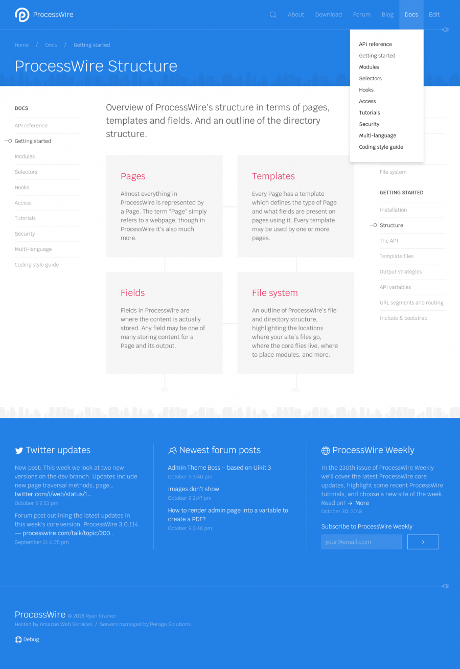
This is a typical index page (page that is more about showing children than content). This also demonstrates the dropdown navigation for the Docs section:
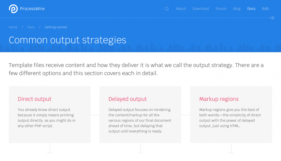
Here's another variation of an index page that we use in other spots where the section navigation isn't as important, so we turn off the sidebars:
Here's a typical content page:

Now we get into the ProcessWire API reference:
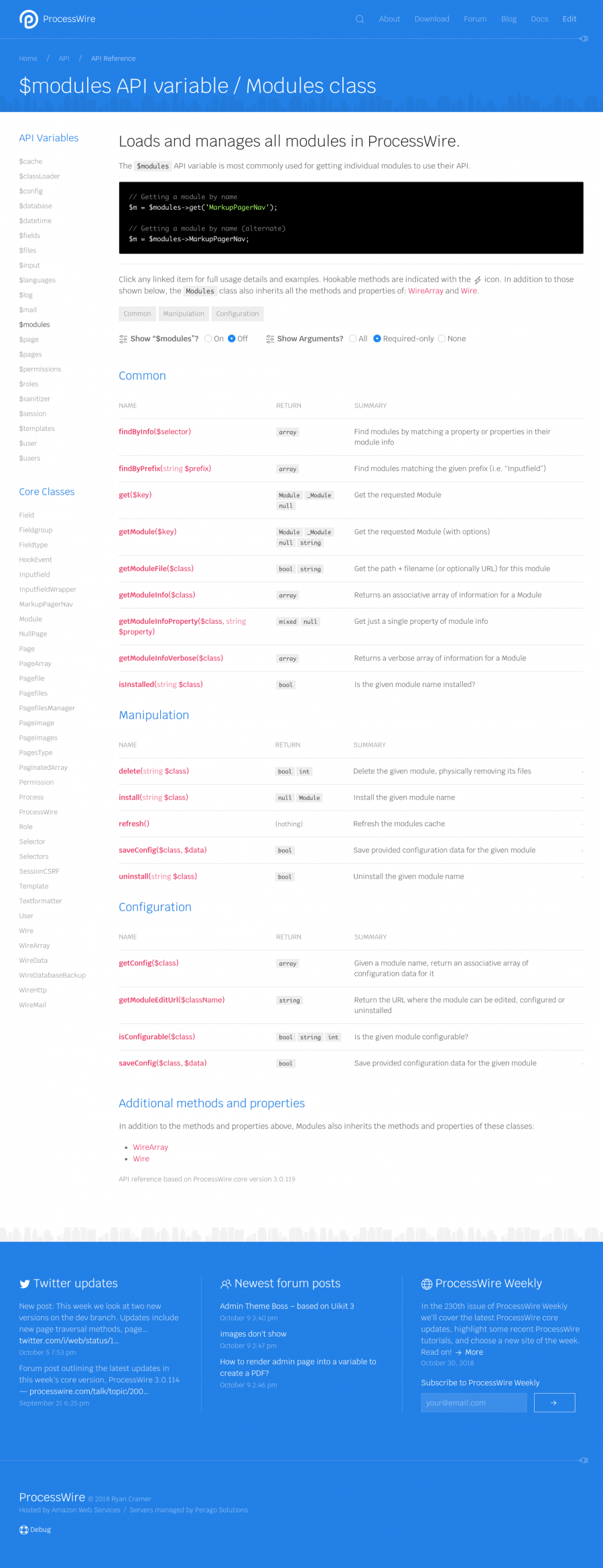
Here's an API reference function details page:
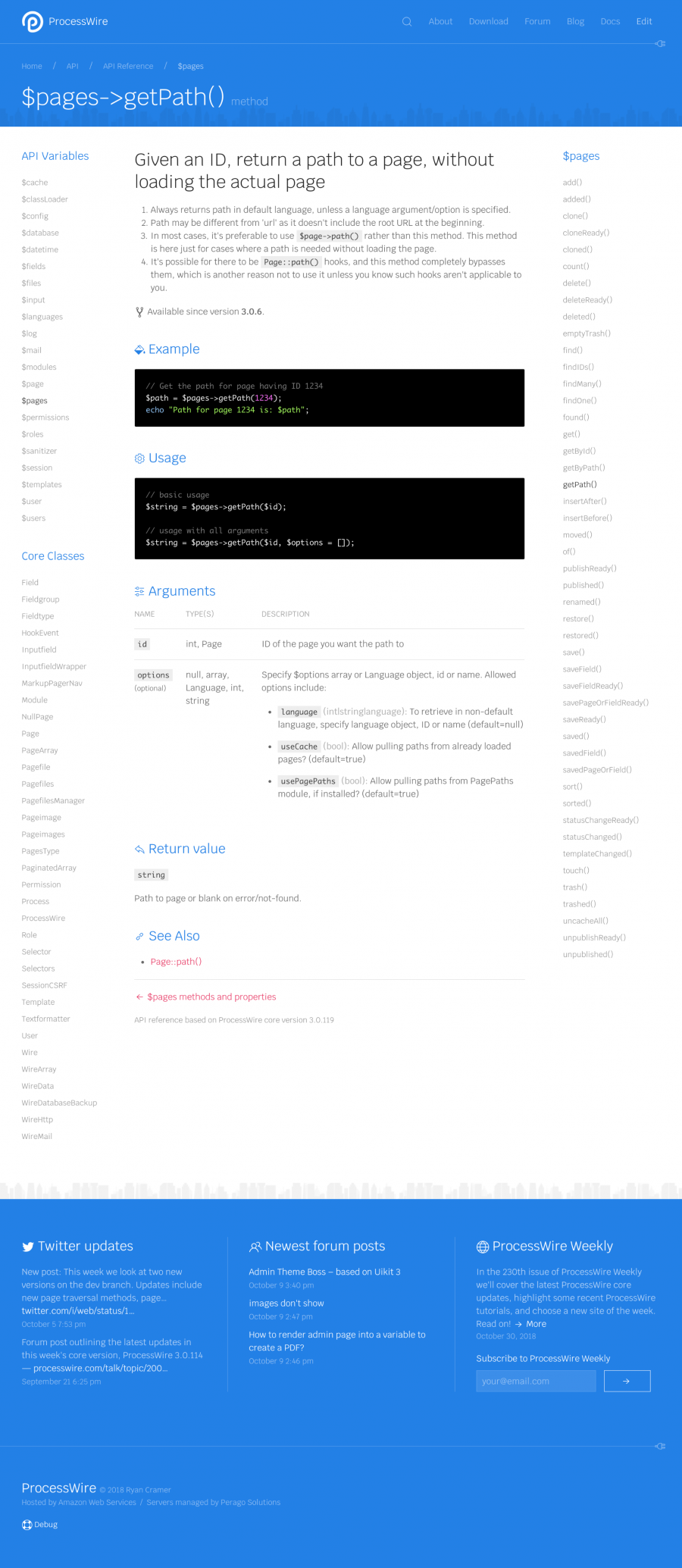
The ProcessWire sites directory is below. This one selects featured categories randomly and displays sliders for each of them. You can click any category to view all the sites in the category. Hovering over any site reveals the details of the site. Clicking the site preview opens the actual website.

This screenshot demonstrates the hover state from the sites directory, where you can see details about each site:
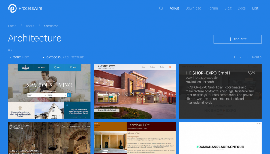
Lastly, you saw this one earlier, but I'll repeat it here again since this is the intended location for it. It shows the dropdown where you can select categories to filter sites by:

Thanks for reading. I hope you all have a great weekend and enjoy reading the ProcessWire Weekly!
Comments


szabesz
- 6 years ago
- 10
★★★★★Great post and features as always, Ryan :) I like the "electrical symbols and motifs". Two things come to my mind: the proper ProcessWire logotype should be used as soon as possible. I know it is still in "draft stage" but this placeholder one with the tiny text next to the P looks silly. Another thing is UIKit's "dark mode", i.e. inverse component. Maybe it could be used to provide dark mode for the site. Nowadays I use the Dark Reader extension to protect my eyes, but a proper dark mode is always better than a hack.
Reply
szabesz
Oh, an regarding "dark mode", black code blocks on white or white code blocks on dark are an issue, because either way we have too high contrast and there is no way to read both the docs and the code snippets in "dark mode" as one of the will always be bright. The current API pages are quite OK in this regard with the subtle code example blocks which look good with the Dark Reader extension as well.
Reply
ryan
To me the logotype just feels kind of legacy, and not really communicating anything other than the words. It also visually competes with the logo mark, so have always preferred just showing one or the other (the mark, or the logotype, on their own). The mark has some good concept behind it that the logotype lacks, so if I choose one or the other, it's always the mark. The logotype also uses fonts that we've not otherwise used for years in PW's branding–it looks like PW 1.0 to me. Overall I just thought the logotype should be dropped for now. But maybe when we get more designers involved that'll change.
Regarding the current ProcessWire non-logotype text: I like just showing the logo mark on its own (like in AdminThemeUikit) OR showing it with unadorned ProcessWire text (like in the screenshots), so that the focus stays on the actual logo mark. I've shifted between showing that unadorned ProcessWire text next to it, and not. If there's consensus that it the text doesn't look good, I'm fine with just showing the logo mark, or maybe just showing the text on hover of the mark, or something like that.
A optional dark mode would be nice, I agree. Maybe something we can experiment with on the site once through the phase one here and getting further into the design side.
Reply
thetuningspoon
I wasn't sure at first, but I think I like it how you have it here, with the logo mark taking center stage and the simple typeface.
Reply
Donatas
- 6 years ago
- 90
★★★★★Absolutely wonderful to see updates to the website! As a designer I try not to dwell too long on the current website and just focus on how incredible ProcessWire is! XD I am currently improving a site for a client with another CMS and it is so frustrating... It seems I could do the necessary changes so much faster with PW! And with so much more flexibility and freedom! I just love ProcessWire! And some of my more tech-savvy clients even thanked me that I introduced them to PW as it made their lives so much easier! So keep up the good work! Best wishes!
Reply
thetuningspoon
- 6 years ago
- 20
★★★★★I like the new look. Not too different but still a nice fresh update. The solid blue background on the sites page is a nice touch. And the copy all sounds great. Works for me!
Reply
Noel
This link provides more info and extended features about the slide concept: https://docs.typo3.org/typo3cms/TyposcriptReference/ContentObjects/Content/Index.html#slide
How could this be implemented in PW? Maybe on top of a field:
$page->title->slide(-1);
// or as a new function:
$page->slide('title', -1);
or for settings:
setting('meta-description')->slide(-1);
// with collect options:
setting('meta-description')->slide(["target" => -1, "collect" => true[);
Reply
Alex
- 6 years ago
- 22
★★★★★Great new functions and really good look of a new website! Can't wait for the next realise version!
Reply
Alexander
closed li missed
Reply
Peter
Love the Slices addition. I've already got a use or it this morning. Thanks :)
BTW don't forget to map all your old URLs to your new page addresses. It's an often overlooked part of any rebuild but essential for your existing Google rankings.
Reply
Noel
Love it already! I absolutely love the full blue screenshots! Great work! Not sure if I'm a fan of the skyscraper-ornaments in the white/blue versions. To my eyes, the wires-only screens are very tidy and modern and perfectly transport the process-wire message. Probably also because the skyscraper-ornaments are part of the current design and without knowledge of the skyscraper profile, have no direct connection to PW. Keep up the great work! Just a thought; maybe use the curves and borders of the logo as inspiration in combination to the wires… adding a more circular look on party of the site or sections – maybe only on the marketing focused, throughoutly designed sections designed to sell PW, like the homepage etc. … Looking forward to more updates!
Ps. Also love the addiction to the API!
Pps. Speaking of the API, is there an option to "slide" trough fields/settings on a page. If not, I think it would be very useful to have settings and values/fields that can be inherited from parent pages but overridden by children. Did anybody else have the need for something like this? The CMS I come from had such a system and it was incredibly powerful also for configuration etc. This just comes to my to mind whenever I see something written about config or settings related. The concept could be really helpful, not only for settings but also for content: https://wiki.typo3.org/Content_Slide
Some simple Examples: Meta-Description which are inherited by children but can be overridden… Or side-bar content, or an author of a page including subpages … but some can have their own author etc etc.
Reply
Topinam
I like the new webdesign!
But i agree with noel, the skyscraper-ornaments are ab bit redundant.
When i started with processwire a few years ago, i was pretty confused about the modules page and all this "Category 1", "Category 2" ... on top. I hope this page is also been refreshed.
Reply
Jonathan Claeys
Great update! The design looks nice, but as mentioned before you should keep the original logo. I'm also not convinced that you should keep the city skyline, just keep it clean and simple, it will feel more professional. It's just clutter and doesn't add any value to the design. The wire elements you've added are great! Simple, but they give an extra touch and referring to the name. Keep up the great work!
Reply
ottogal
I'm also looking forward to the new PW website!
As far as I see the graphic design is not yet in the focus at the moment, since content and structure have precedence. So the skyscraper ornaments might not be there in the final result (even if they remind about the nice skyscraper example page).
But when it comes to the graphic design:
Please, please make the light grey and very light grey font colors darker!
I don't know when this terrible fashion emerged in the web, but it's extremely tiring to read texts having such low contrast. (Maybe there is scientific research saying that high contrast is more tiring, but, at least for my not so young eyes, the opposite is true.)
So please change #a0a0a0 to #808080, #aaaaaa to #999999, #444444 to #404040, and so on!
By the way, I like the blue background and headlines, but would prefer it a bit darker, too. I propose #196ee6 instead of #2380e6.
But I admit, this is certainly a matter of taste.
Kudos to Ryan for his incredible work!
Reply
Alexander
- 6 years ago
- 01
★★★★★echo $items->each("{title}");
missed
Reply
Eelke
- 6 years ago
- 00
★★★★★Looking great!
Something I would look for as a possible new user is how you can easily also create a headless CMS with ProcessWire, seeing how there is a huge SPA-world out there.
There are a couple of great modules to help a user out with this, such as RestAPI & RestAPIProfile, PageQueryBoss, ProcessGraphQL (and possibly others), and I think this strategy would deserve a place in the Output strategies section.
Reply
Noel
- 6 years ago
- 00
★★★★★Ryan, when you go about redesigning the modules section, you might find this inspiring:
https://statamic.com/marketplace/addons/
I like the entire site, it's very clean and simple (look at that menu)
BTW: after a quick test-drive of the actual product – I'm safely back in the PW Powerhouse ;) every time I try something different (most of the time because of the look and feel or because it has an easy to learn Framework like larval beneath), it just can't keep up with PW! Congrats Ryan!
Reply